BluePrintz iOS App
An app that allows users to mock up exterior finishes – e.g. paint, brick, siding – on a photo of their home.
I collaborated with the lead designer and engineer at Blueprintz to improve their KPIs: App Store star rating and refund requests.
Left: Existing app design
Right: My revised design
The Opportunity Space
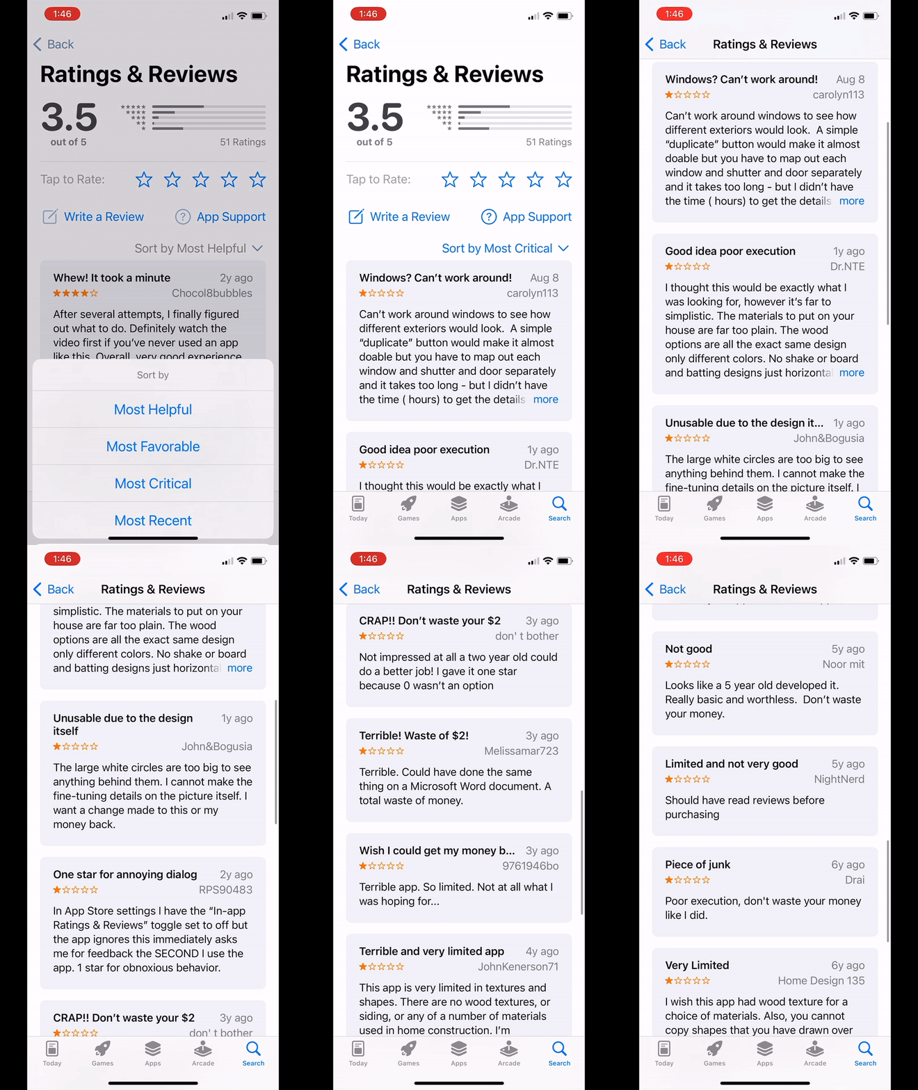
BluePrintz app has a long history of 1-star reviews in the iOS App Store & refund requests in the company’s inbox.
These are the KPIs the BluePrintz team uses to gauge the app’s success.
After an initial run-through of its key tasks, it was easy to understand the negative reviews.
What was puzzling were a few 4- and 5-star reviews that seemed to think the app did the job it needed to do adequately - perfectly, even, in some cases!
So, BluePrintz wasn’t a lost cause — far from it!
My Role
Sole UX Researcher & Designer
Tools
Figma
Figjam
Pencil/Paper
iMovie
Methods
Google Slides
Google Sheets
Googe Forms
Google Meet
otter.ai
Cognitive Walkthrough
Competitive Audit
Think-Aloud Evaluation
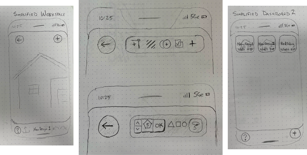
Lo-Fi Sketch Prototypes
Tech Scoping
Kano Analysis
Impact vs. Effort Analysis
Hi-fi interactive Prototypes
Summary
I learned above all that BluePrintz works.
Despite misclicks, struggles, and frustration all test subjects stated that, by the time they’d completed all the key tasks in the evaluation, they understood how the app worked!
For BluePrintz - what’s limiting KPI and revenue performance is simply this:
BluePrintz has a learnability problem.
The Process
I performed a competitor audit, including the stakeholders’ known competitors & others I found while shopping around.
The Competitive Space
There are several apps - both web-based and mobile - that are designed to accomplish similar goals to BluePrintz.
Many of these were more learnable, more functional, and more flexible.
While BluePrintz wasn’t as advanced as some of these other apps, BluePrintz’ simplicity could be an asset in a more crowded marker
Is It Functional?
Well, yes! In Think-Aloud evaluations, once users had completed every key task, they understood how to use the app. It took some failure and some frustration, though.
Problem: 3/3 participants expressed that they would have given up before they got to that point.
When App Store reviewers rated BluePrintz highly, they recommended that users watch BluePrintz’s how-to video before using it.
The video does do a good job of teaching users what they need to know in order to start work ing in the app.
Problem: 7/7 participants in the Cognitive Walkthrough and Think-Aloud Evaluations expressed that they did not want to watch a video—they just wanted to get started!
Figure 2: Which option would you try first in order to put brick or siding on this home?
Figure 1: Before BluePrintz added a how-to video, they averaged about 1 star out of 5 in the App Store
Is It Learnable?
Look at the screen in Figure 2.
What’s a user supposed to do first here? Materials, colors, shapes? Something else?
3/3 users did not select the correct option to get started. Success took trial, error, and frustration.
Testers found additional aspects of the journey were unintuitive or difficult to use, although they were able to figure some things out along the way.
Testing gave me quite a lot of ideas for feature prototypes!
Lo-fi Prototypes
Tech Scoping + Kano Analysis
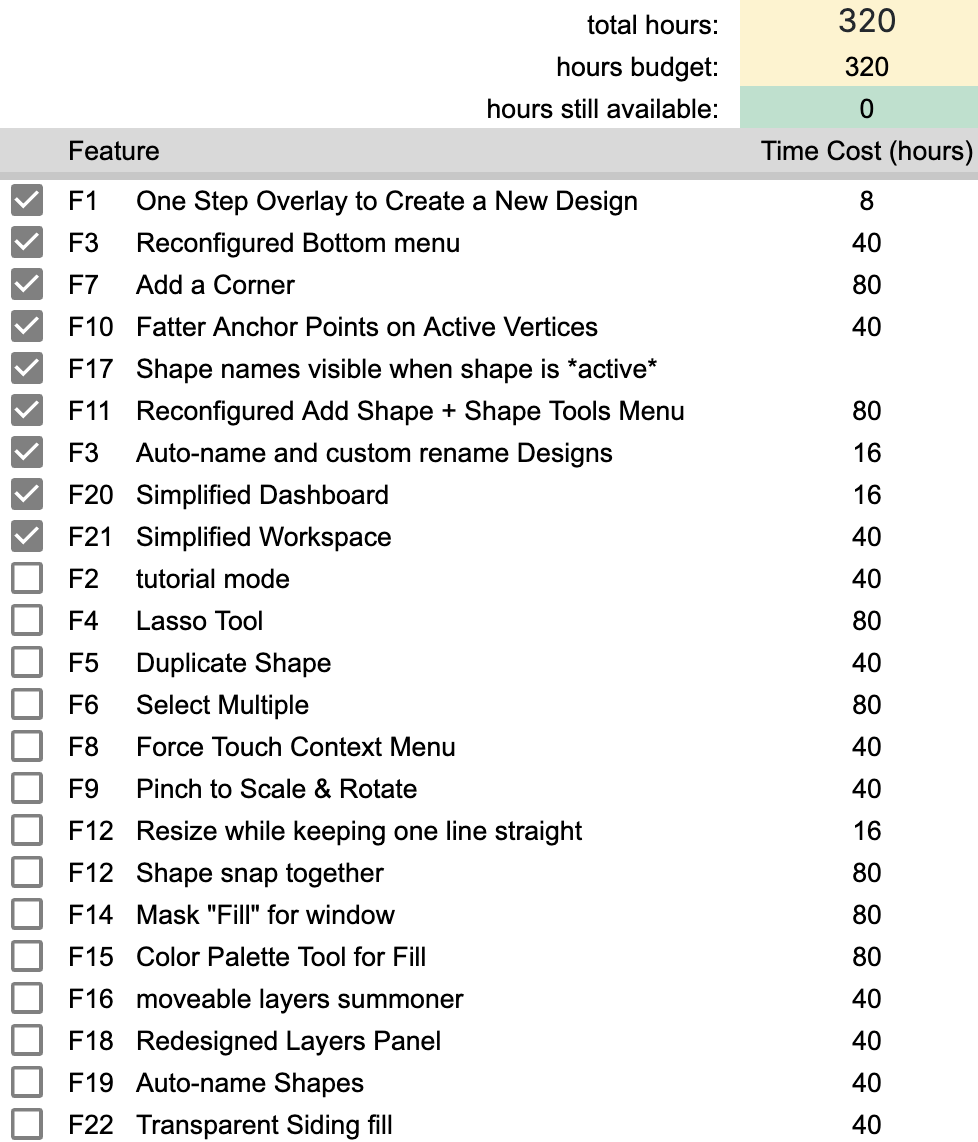
After reviewing 24 prototypes with the lead engineer at BluePrintz, I understood the effort it would take to implement each feature, plus a budget within which to work.
I performed a Kano Analysis to determine the impact each feature might have in the eyes of representative users
The impact of a feature vs. the effort to implement it. This chart informed my recommendations for the design sprint.
Working within the Budget
Given a total project budget of 320 hours, the biggest challenge I experienced in this project was checking my ego.
I had to balance feedback from users and BLuePrintz’s tech lead with my own tastes and impulses on what I FELT ought to be done. Cutting features that I thought were important felt hard - irresponsible even!
I needed to remind myself that future design sprints are possible. In fact, they’re highly likely to happen!
I used a spreadsheet to quickly activate and deactivate different features to easily plan for priortizing the most impactful features.
Hi-Fi Prototypes
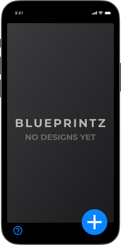
1. Simplified Dashboard for error prevention - tap plus icon to begin

2. Start a new project by uploading a photo, view help documentation, or go back to dashboard
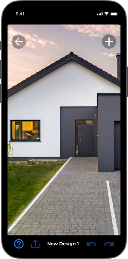
3. Simplified workspace - press plus to summon the "add shape" menu

4. Add a basic shape or create a custom polygon

5. With a shape added, the "shape tools" menu appears.

6. Add corner tool means you can adjust your shapes on the fly, rather then delete and remake.
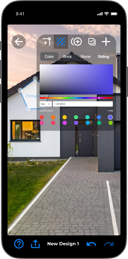
7. The full color palette tool allows users to select colors or use their own hex codes

8. This time let's add a pentagon
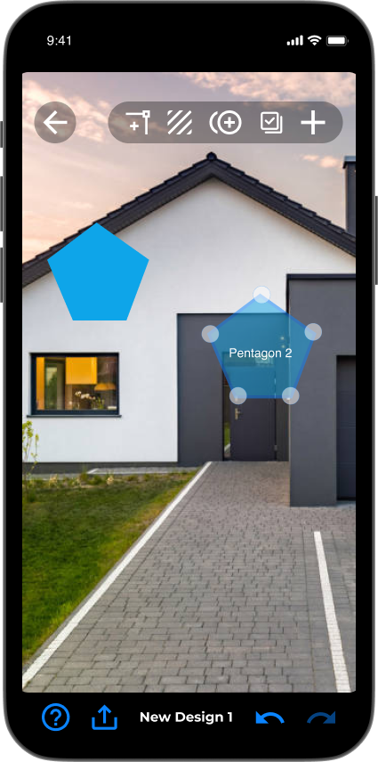
9. The focus shifts from the previous shape to the new shape, and the "shape tools" menu appears
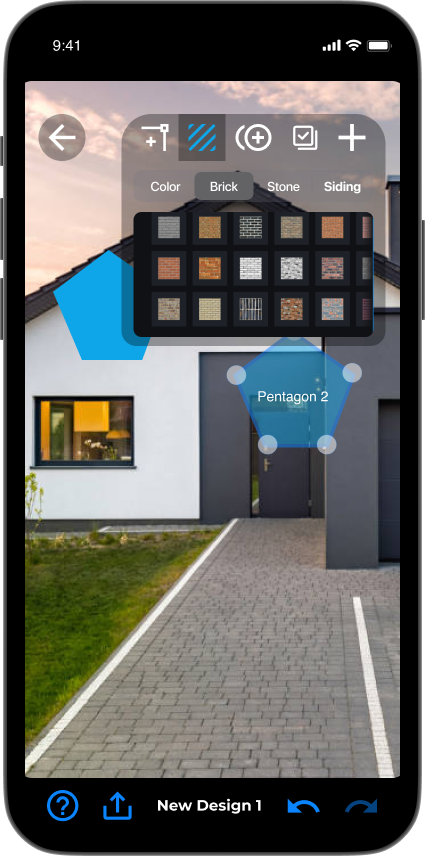
10. The fill tool also allows users to select materials like brick, stone, and siding.
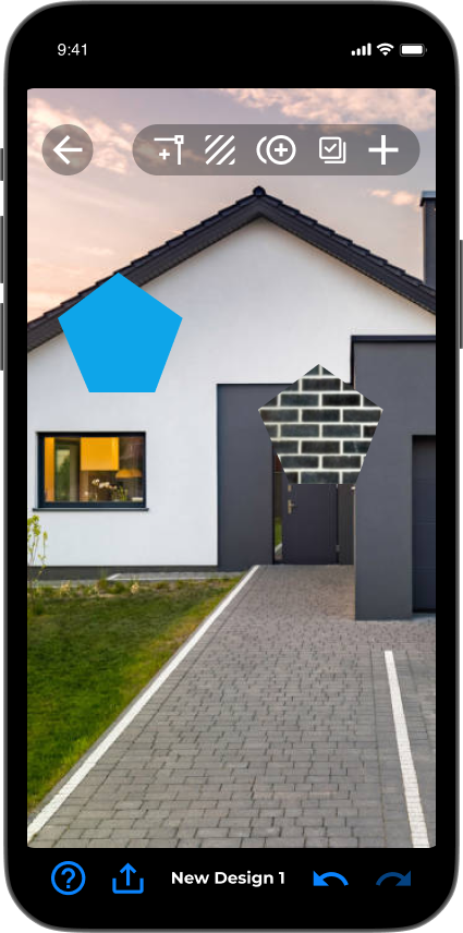
11. The vertices of each shape can be dragged to cover custom-sized areas to mock up a finish!
Prototyped features to include in the next design sprint:
One-Step overlay to create a new design
Lowest possible friction to get started
Simplified Dashboard and Workspace
Nothing is available to tap unless it’s useful. These bumpers keep users from rolling a gutterball
Reconfigured Menus
A better looking, more consistent, less obtrusive, natural hierarchy
Add a Corner + fatter anchor points
Easy error recovery and error prevention

