Opportunity Space:
B2B Sales + Customization, w/ lower friction
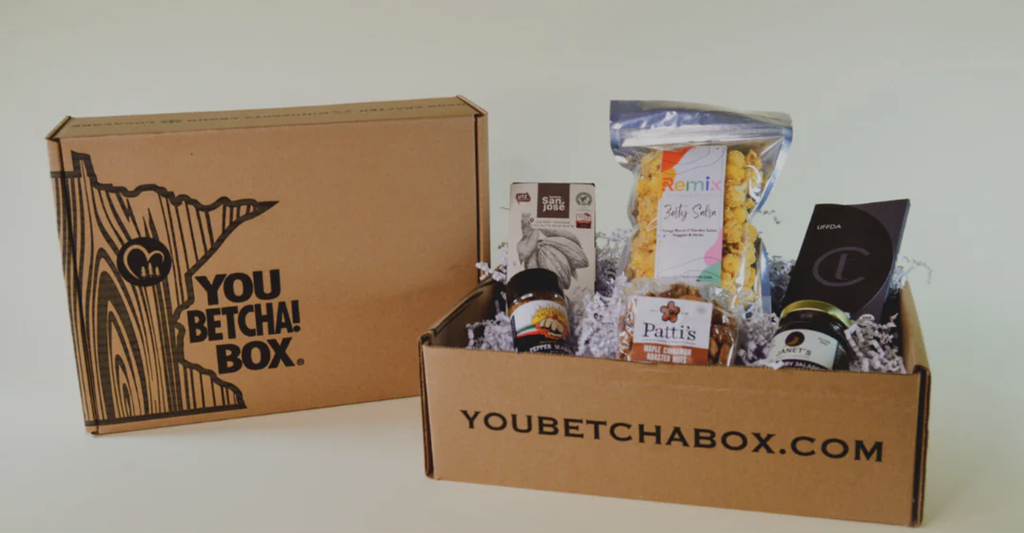
YouBetcha!Box — a curated gift box purveyor in Minneapolis, MN — had their eyes on two opportunities for growth through their web store:
Driving direct business-to-business sales, and
Empowering users to build & order custom gift boxes using tools on their website.
When they came to me for help, I provided research-based insights & prototyped solutions to accomplish their goals while reducing friction throughout the shopping experience.
Feature Recs
Two paths to build a box
Powered-up product filters
Multi-address shipping
Order tracking table
Saved Collections
My Role
UX Researcher + Designer
Team + Individual Work
Tools
Figma
Pen + Paper
Google Sheets
Zoom
Methods
Competitive Audit (Team)
User Journey Maps (Ind.)
Feature Concept Cards (Ind.)
Stakeholder Interview (Team)
Tech Consultation (Team)
Kano Survey & Analysis (Team)
Summary
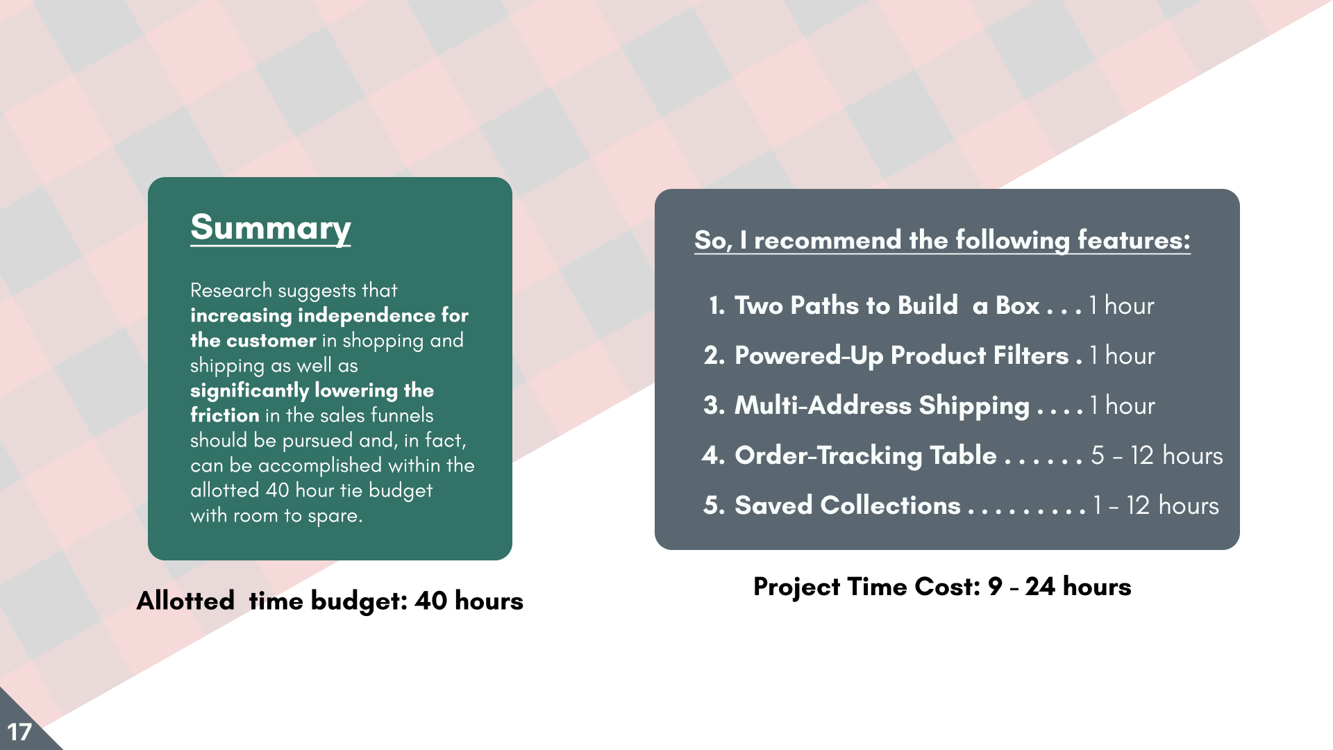
Research suggests increased customer independence in shopping & shipping, plus lowered friction in sales funnels should be pursued. All this can, in fact, be accomplished in the allotted 40-hour time budget—with room to spare.
Methods:
Discovery + Prototyping
The competitive audit showed opportunities to lower friction and improve B2B sales.
Stakeholder Interview + Competitive Audit
My team and I participated in a stakeholder interview with YouBetcha!Box to get a better picture of the company’s goals & the obstacles they face.
Our stakeholder gave us a rundown of other web stores that have the same or similar functionalities as they want to add.
We rated these websites on five affordances in order to learn:
What features exist?
What are others doing well?
What gaps are there to be filled by our stakeholder?
Prototyping
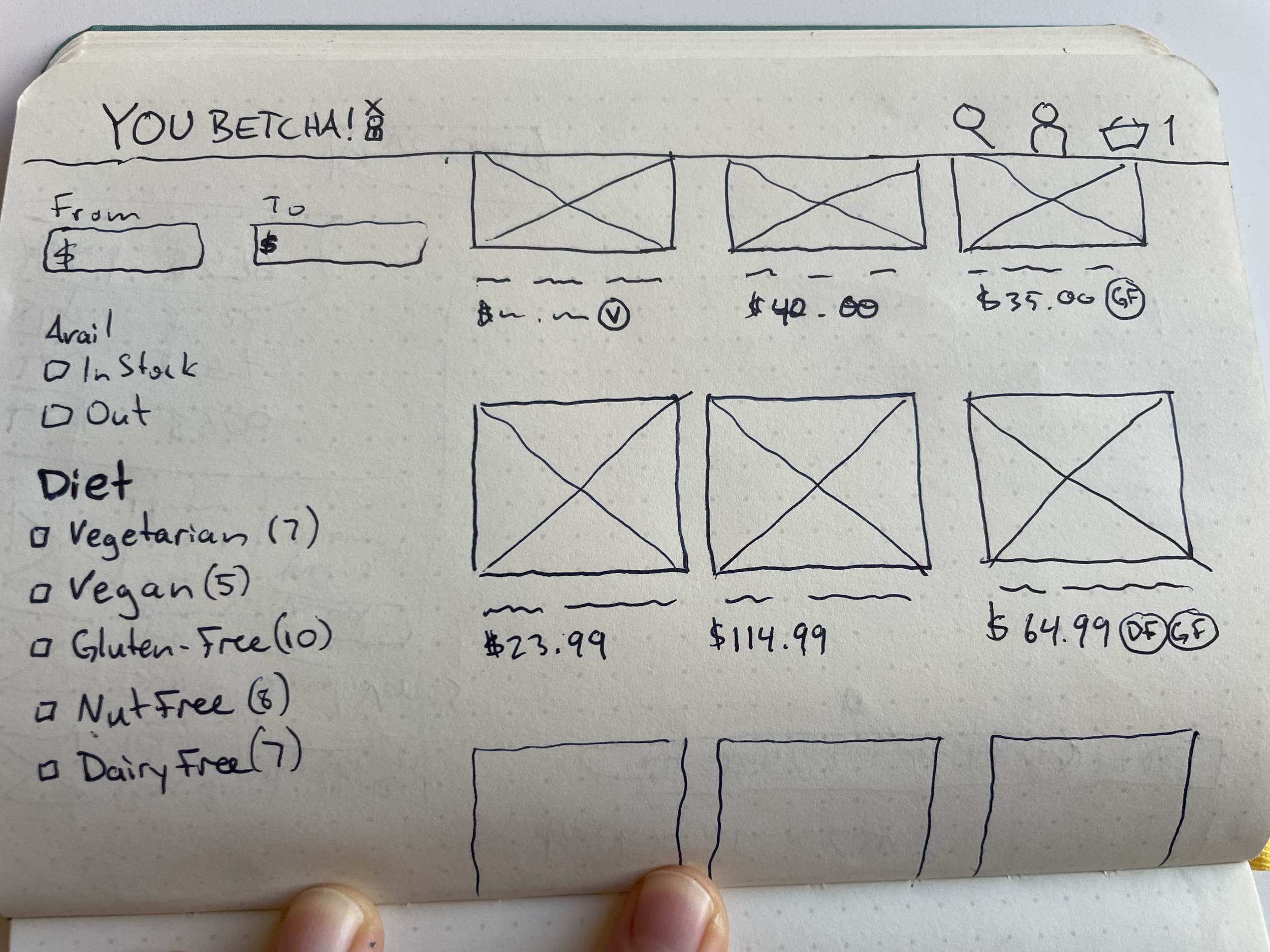
At this point, it was time to bust out the sketchbook!
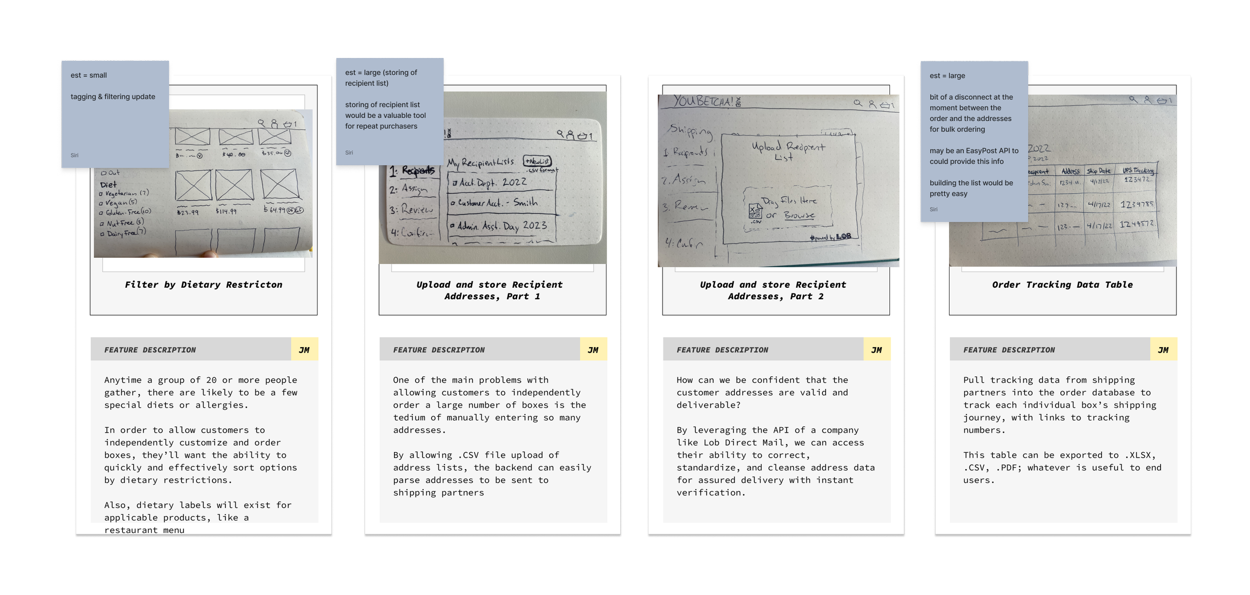
I let my pen lead me through some ideas for improved interfaces on a few key screens. Once I felt that I had a good platform from which to launch, I submitted these four as feature cards for review.
The company’s Commerce Technology Specialist weighed in & advised on feature feasibility & scoping.
The feature cards were reviewed for scope and feasibility by the client
Kano Analysis
With a Figjam board full of ideas and a budget of only 40 hours of work, we needed to weigh feature scope vs. desirability.
In our Kano analysis, six users evaluated thirteen features. My team and I evaluated the results in a spreadsheet, and five features stood out above the rest as clear wins that fit snugly into our budget.
I was ready to move forward.
The User’s Journey:
—>
Insight One:
Powered-up Shopping Filters
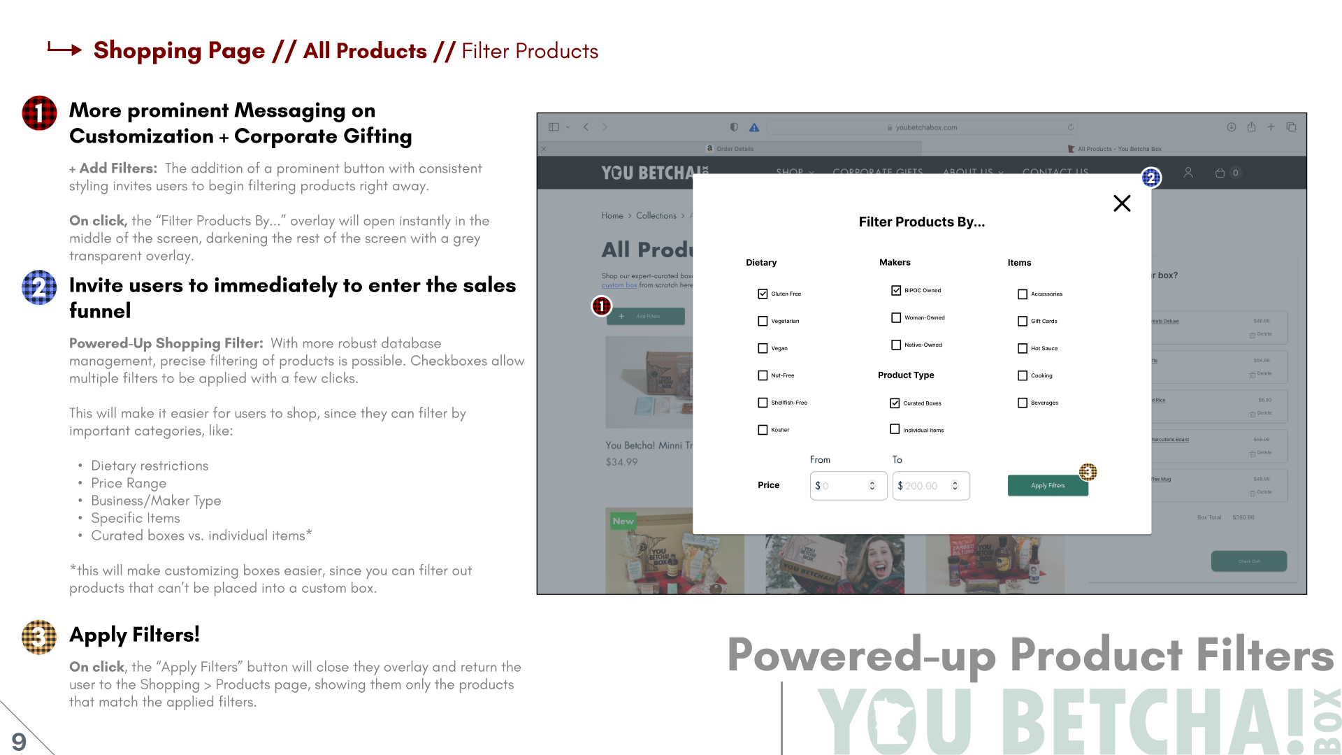
In the Kano Analysis, users rated better filtering at 5.8 out of 7 on an importance scale.
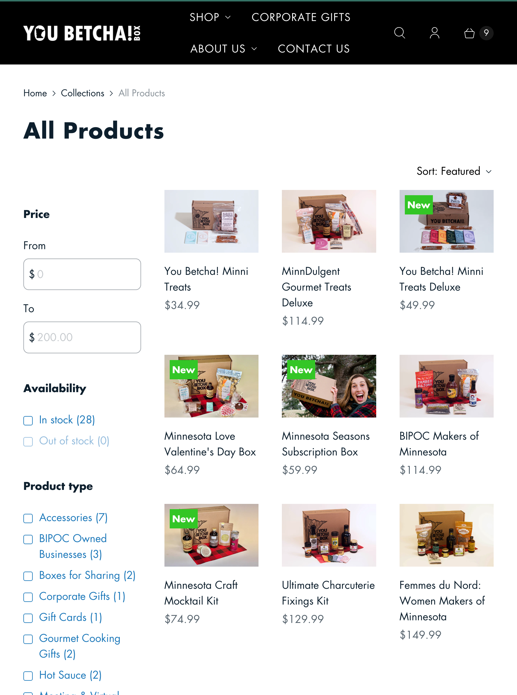
The present state of the website (top left) offers little in the way of filtering options.
This lo-fi prototype sketch (middle left) allowed me to put my thoughts to paper.
Taken to high fidelity (below), the filter toolbox overlay prototype keeps users focused while filtering, then presents the perfect lineup of products for their needs.
Top: Present state of the site; Middle: Lo-fi Sketched wireframe prototype; Bottom: Hi-fi wireframe prototype
Insight Two:
Two Paths to Build a Box
The website’s present state has just one way to shop for customized & bulk corporate orders.
Fill out the contact form, then wait to be assisted.
Customers love the YouBetcha!Box’s curated collections, but the company sees a growth opportunity in custom-built boxes for consumers and businesses alike.
YouBetcha!Box wants to grow its B2B sales while reducing friction on all types of orders.
Top: Present state: home page; Bottom: Present state: shopping page
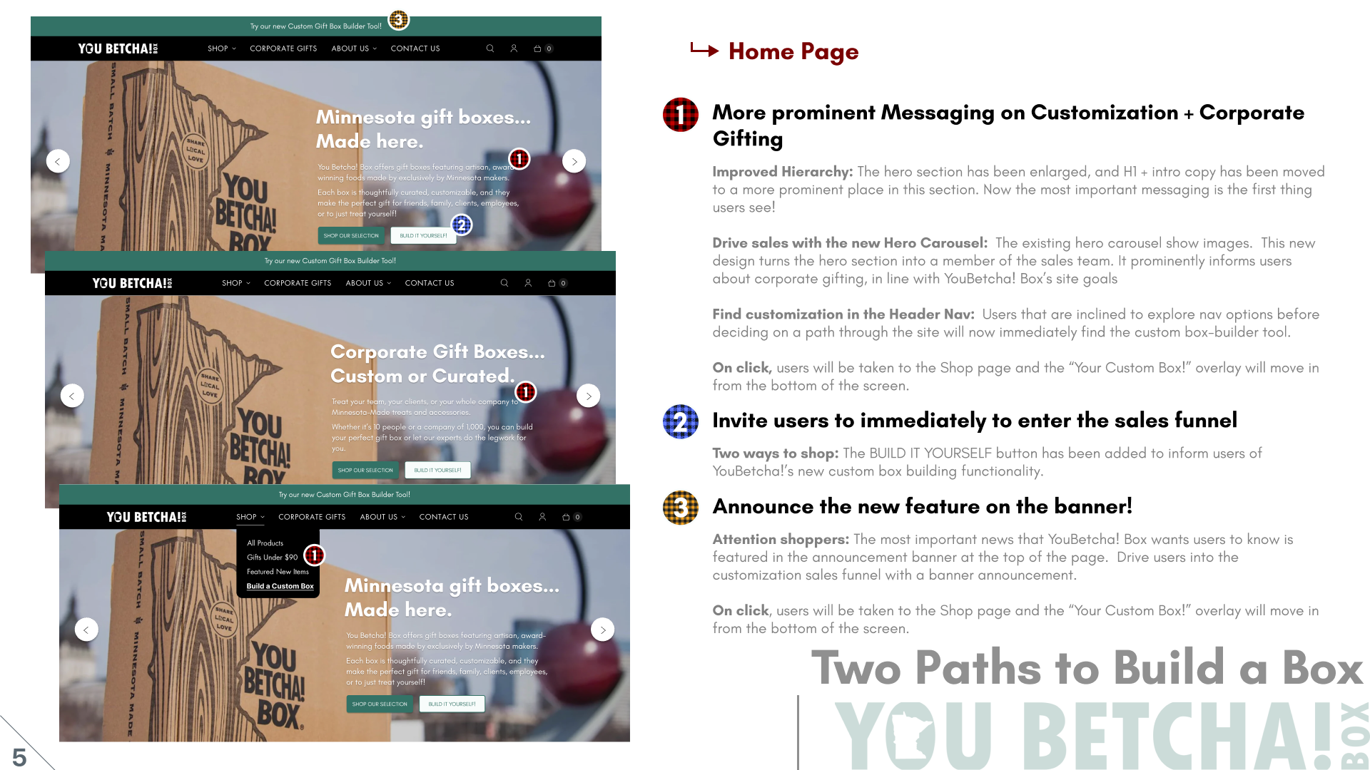
The redesigned hero section with carousel guides customers to the features the client wants them to see!
In the Kano analysis, users rated a custom box builder tool as an attractive feature. One user said:
“I really think the option to start by modifying something existing is a real nice feature I would not have considered.”
With a scoped time investment of just one to four hours, including this feature felt like the biggest bang for our client’s buck.
In order to lead customers into the custom-build funnel, I began with the home page.
Insight Three:
Improved Shipping + Order Tracking
In the Kano Analysis, participants rated my prototyped multi-address shipping prototype as a performance feature, bordering on must-have.
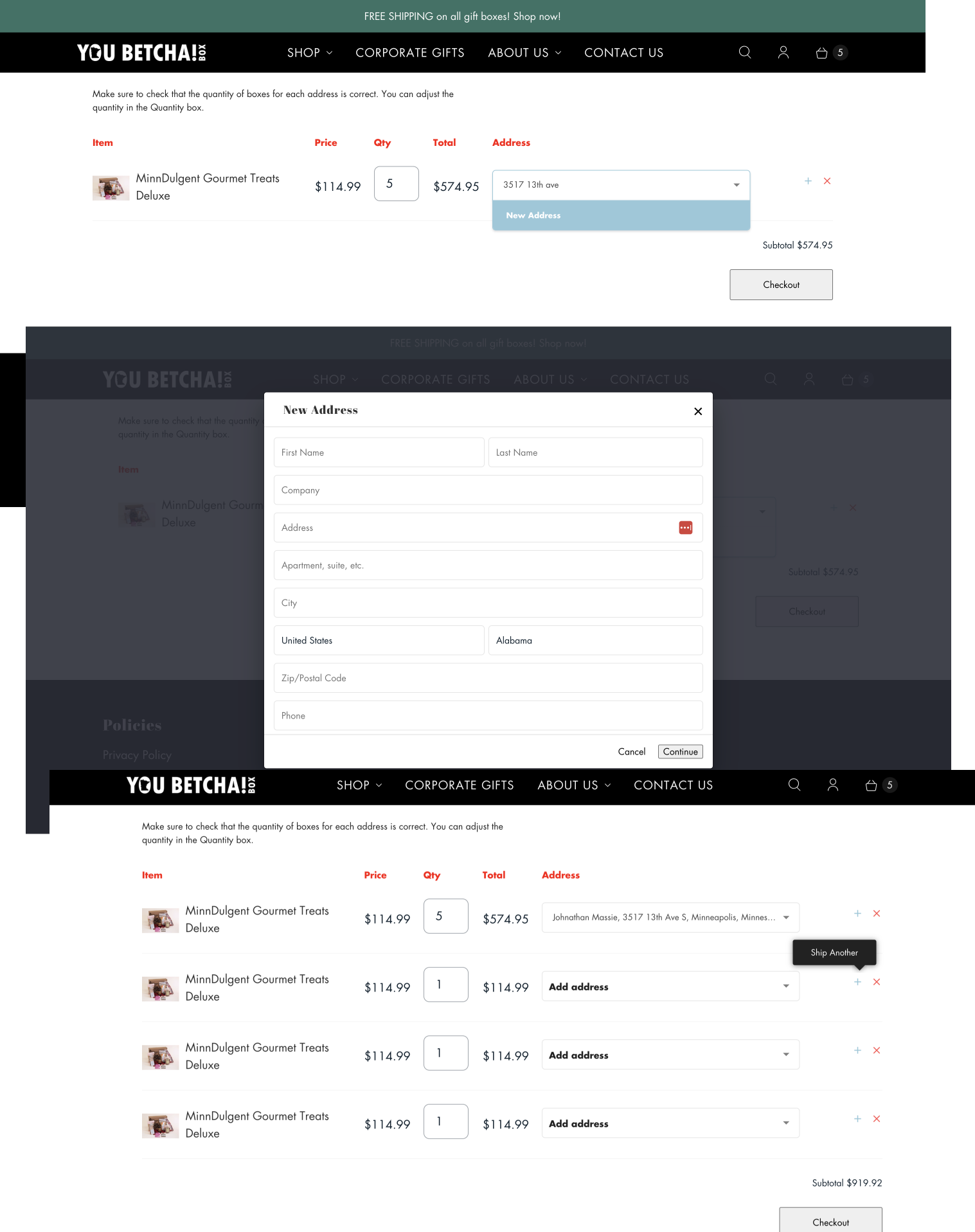
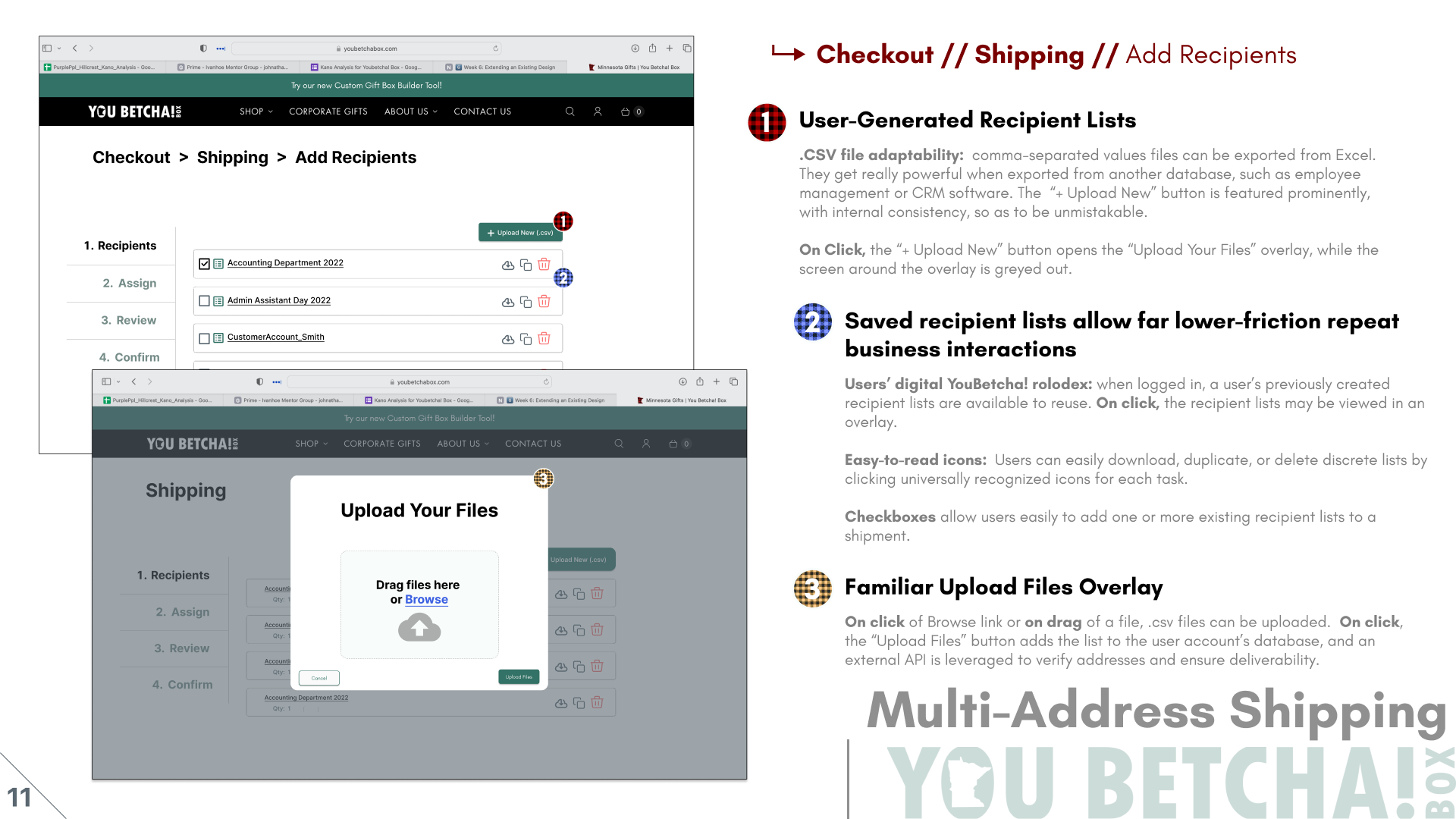
In the present version of the shipping experience, pictured left, customers have to enter each address one at a time. Every new address must be entered into a form in an overly.
Lots of clicks, lots of mental focus, lots of frustration. If you did this once, would you want to do it again next time?
Top to Bottom: The present shipping workflow on the YB!B web store
What if your recipients could add their addresses for you? What if you could export them from your HR software, or your CRM system?
The customer can upload a .csv file directly to the site, eliminating the present high-friction path of entering each address on its own.
A recipient list can be given a memorable name and you can save it for later re-use.
With this feature, I recommend leveraging the power of a 3rd party direct mail service - like Lob - to verify addresses and optimize them for deliverability.
A new way to ship: annotated prototypes of the recommended future state of the chipping flow in the YouBetcha!Box store.
Insight Four:
Saved Collections
Most online stores offer the ability to favorite items to purchase them later. YouBetcha!Box would benefit from that feature.
If customers aren’t quite ready to buy, but they’re enjoying shopping, they can save collections of their favorite items either using their user account or by accepting cookies.
In the Kano analysis, participants rated saved collections as a Delight feature.
Given its ability to decrease shopping friction for repeat site visitors, and its low one-hour scope of work, it’s a perfect candidate to add to this design sprint.
Conclusion:
Summary + Recommendations
